制作分布图类似密度图,在python中利用pandas来提取分布数据是比较方便的。主要用到pandas的cut和groupby等函数。
第一步,从数据库中提取数据 1 2 3 4 5 6 7 8 9 10 11 12 13 14 15 16 17 import pandas from sqlalchemy import create_engine host_mysql_test = '127.0.0.1' port_mysql_test = 3306 user_mysql_test = 'admin' pwd_mysql_test = '1234' db_name_mysql_test = 'mydb' engine_hq = create_engine('mysql+mysqldb://%s:%s@%s:%d/%s' % (user_mysql_test, pwd_mysql_test, host_mysql_test, port_mysql_test, 'hq_db'), connect_args={'charset': 'utf8'}) sql = "SELECT * FROM fund_data where quarter>=8 order by yanzhi desc" df = pd.read_sql(sql, engine) #将yanzhi数据转换为百分比 df['yanzhi'] = df['yanzhi'].apply(lambda x: x * 100)
第二步,面元划分
cut函数:1 pandas.cut(x, bins, right=True, labels=None, retbins=False, precision=3, include_lowest=False)
官方文档链接
主要参数为x和bins。
1 2 bins = [0, 10, 20, 30, 40, 50, 60, 70, 80, 90, 100] cats = pd.cut(df['yanzhi'], bins)
我们定义bins为一个序列,默认的为左开右闭的区间:
1 2 3 4 5 6 7 8 9 10 11 12 13 14 15 16 In[]:print cats Out[]: 0 (90, 100] 1 (90, 100] 2 (90, 100] 3 (80, 90] 4 (80, 90] ... 970 (10, 20] 971 (10, 20] 972 (10, 20] 973 (10, 20] 974 (10, 20] Name: yanzhi, dtype: category Categories (10, object): [(0, 10], (10, 20], (20, 30], (30, 40], ..., (60, 70], (70, 80], (80, 90] , (90, 100]]
第三步,groupby 对言值列按cats做groupby,然后调用get_stats统计函数,再用unstack函数将层次化的行索引“展开”为列。
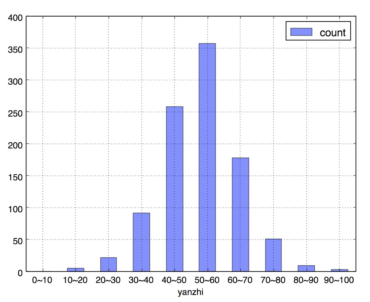
1 2 3 4 5 6 7 8 9 10 11 12 13 14 15 16 17 18 19 20 def get_stats(group): return {'count': group.count()} grouped = df['yanzhi'].groupby(cats) bin_counts = grouped.apply(get_stats).unstack() print bin_counts count yanzhi (0, 10] 0 (10, 20] 5 (20, 30] 22 (30, 40] 92 (40, 50] 258 (50, 60] 357 (60, 70] 178 (70, 80] 51 (80, 90] 9 (90, 100] 3
第四步,重命名索引,pandas绘图 1 2 3 4 bin_counts.index = ['0~10', '10~20', '20~30', '30~40', '40~50', '50~60', '60~70', '70~80', '80~90', '90~100'] bin_counts.index.name = 'yanzhi' bin_counts.plot(kind='bar', alpha=0.5, rot=0)
扩展:其它工具绘制 一,用G2绘制 G2在之前的文章中有介绍,文章《python结合G2绘制精美图形》 。
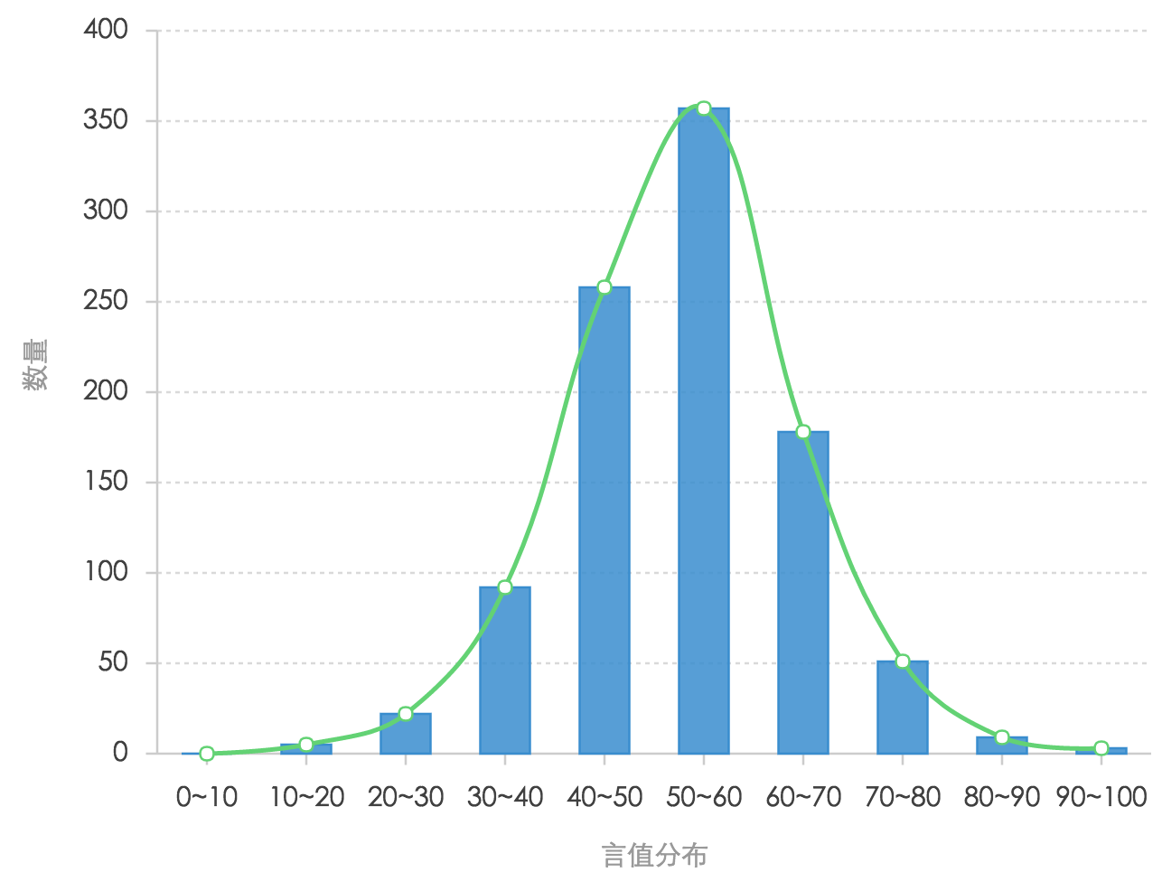
1,生成json数据 1 2 3 4 5 6 7 8 9 datas = [] for ix, row in bin_counts.iterrows(): # if row['机构数量'] > 0: sss = {'name': ix, 'count': row['count']} datas.append(sss) encodejson = json.dumps(datas, ensure_ascii=False) f = open('yanzhi.json', 'w') f.write(encodejson) f.close()
2,配置html文件 1 2 3 4 5 6 7 8 9 10 11 12 13 14 15 16 17 18 19 20 21 22 23 24 25 26 27 28 29 30 31 32 33 34 35 36 37 38 39 40 41 42 43 44 45 <!DOCTYPE html> <html> <head> <meta charset="utf-8"> <title>分布图</title> <link rel="stylesheet" type="text/css" href="https://as.alipayobjects.com/g/datavis/g2-static/0.0.8/doc.css" /> <!--如果不需要jquery ajax 则可以不引入--> <script src="https://a.alipayobjects.com/jquery/jquery/1.11.1/jquery.js"></script> <script src="https://a.alipayobjects.com/alipay-request/3.0.3/index.js"></script> <!-- 引入 G2 脚本 --> <script src="https://as.alipayobjects.com/g/datavis/g2/1.2.2/index.js"></script> </head> <body> <div id="c1"></div> <!-- G2 code start --> <script> $.getJSON('yanzhi.json', function(data) { var Frame = G2.Frame; var frame = new Frame(data); frame = Frame.combinColumns(frame, ['count'],'count','type',['name', 'count']); var chart = new G2.Chart({ id: 'c1', width: 600, height: 400 }); chart.source(frame, { 'count': {alias: '数量', min: 0}, 'name': {alias: '言值分布', min: 0} }); // 去除 X 轴标题 // chart.axis('name', { // title: null // }); chart.legend(false);// 不显示图例 chart.intervalStack().position('name*count').color('type', ['#348cd1', '#43b5d8']); // 绘制层叠柱状图 chart.line().position('name*count').color('#5ed470').size(2).shape('smooth'); // 绘制曲线图 chart.point().position('name*count').color('#5ed470'); // 绘制点图 chart.render(); }); </script> <!-- G2 code end --> </body> </html>
3,显示结果
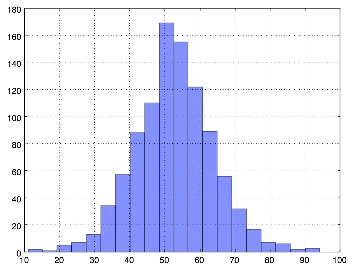
二、DataFrame密度图 一句话绘制出来,但具体的区间段难以区分出来。
1 df["yanzhi"].hist(bins=20, alpha=0.5)
三、bokeh绘图 bokeh是python的一个优秀的绘图工具包,与pandas结合的比较好。bokeh文档
1 2 3 4 5 from bokeh.charts import Histogram, output_file,show hist=Histogram(df, values='yanzhi',bins=30, title='分布图', legend='top_right') output_file('hist.html', title='hist example') show(hist)